Think of Tiffany & Co – are you thinking Tiffany blue? Or how about Selfridges? Seeing their yellow bags? Consistent colour usage not only helps to build brand recognition, how you use colours online affects readability, the visual impact of the website, stand out elements, and how consumers feel. Here’s a visual look at what colours mean to help you start using colour as part of your strategy.
Neutral Colours
White, Black, Brown. These colours are best used as background and paragraph copy colours. Their neutrality makes a great canvas for other colours to draw the eye.
White can mean purity, safety, contemporary, refined & truthful. Black text on a white background is the easiest to read.
Black can mean serious, distinctive, strength, bold & classic. Great canvas for bright colours. Use cautiously as a background colour as it’s harder to read light text on a dark background.
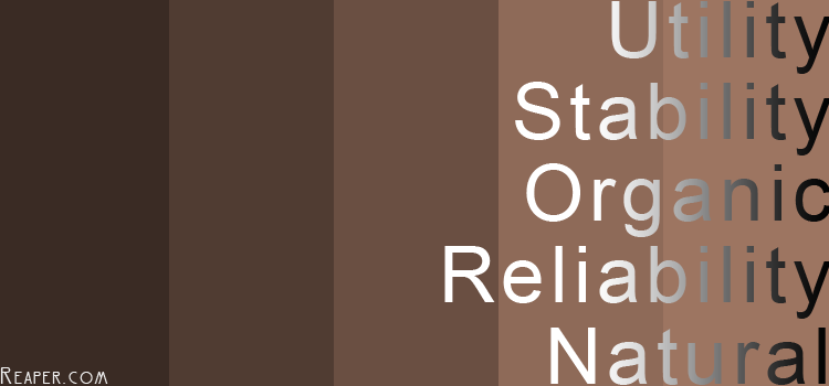
Brown can mean utility, stability, organic, reliability & natural. Use cautiously as a background colour as it’s harder to read light text on a dark background.
Accent Colours
These colours should be used sparingly – think elements rather than background or content. Creating a colour palette can show how well colours work together & how well the colour contrasts on the background. If the contrast is too low it can make content hard to read.
Where to use accent colours
- Headings
- Buttons
- Quotes
- Links (link, hover, visited, active)
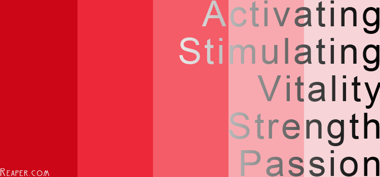
Red can mean activating, stimulating, vitality, strength & passion. Brings text to the foreground & can encourage people to make quick decisions. Widely used to evoke erotic feelings as well as to indicate danger.
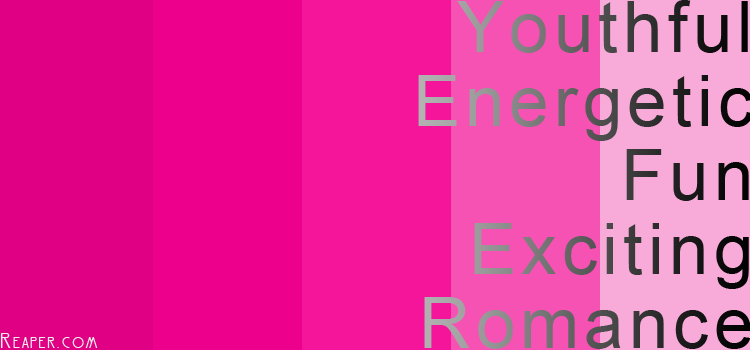
Pink can mean youthful, energetic, fun, exciting & romance. Typically seen as a feminine colour, darker shades of pink can have the same visual impact as red.
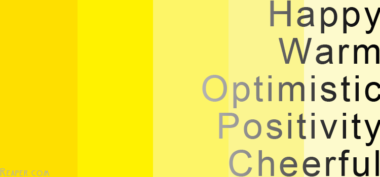
Yellow can mean happy, warm, optimistic, positivity & cheerful. Evokes pleasant, cheerful feelings & great to attract attention.
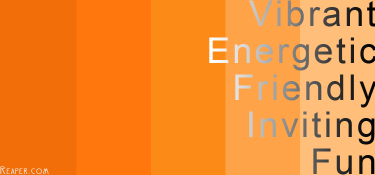
Orange can mean vibrant, energetic, friendly, inviting & fun. Use for elements you want to catch visitor’s attention. Effective for promoting food products & toys.
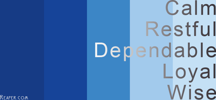
Blue can mean calm, restful, dependable, loyal & wise. Avoid using for food & cooking as it suppresses the appetite. Great for products & services related to cleanliness.
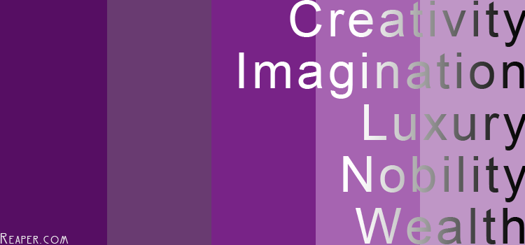
Purple can mean creativity, imagination, luxury, nobility & wealth. Deep purples can be a great alternative to black to evoke a sense of luxury.
Green can mean tranquility, health, calming, harmony & freshness. Often used for environmental and financial websites.
Test Colours Out
Google tested out 42 shades of blue for their paid search links – the result was a $200 million increase simply because they found out which shade of blue people responded to best.
It’s great to reinforce branding by using your brand’s colours in the website design, but don’t be afraid to test out different shades or colours for buttons and links – some colours simply work better at increasing conversions. Use A/B testing to see which colours drive the reactions you want.
What colours do you respond to online? Offline?
- Written by Nicholas Young
- 5 March 2012


